Blogs
Guest Post: Current State of ComDaAn: Community Data Analytics, by Christelle Zouein
Tags: KDE, Community, Data Analytics, enioka
If you remember my previous post, I mentioned that some work has been happening thanks to an intern we had for a few months at enioka Haute Couture. Well, we thought it would be unfair to just take credit of her work and so she wrote a piece about her internship that we’re sharing with the world.
The following is the description of the current state of ComDaAn in her own words. It has been previously published in french on the enioka blog and on her own blog as well
Thanks again Christelle for the wonderful work you did. The stage is yours now!
Current State of ComDaAn: Community Data Analytics, by Christelle Zouein
Faced with the growing number of tools developers use to write and distribute code, we’ve decided to have a closer look at the data footprint these leave behind. ComDaAn analyzes said footprint to offer an insight into the inner workings of developer teams and open sources communities.
It can be used to examine how different communities and teams function by for example looking at the commits of a git repository over time. This can be particularly useful in the case of a technical audit or to select the software “brick” whose community has the best long-term chances.
This article will cover community data analytics in the context of open source development and free software. More specifically it will seek to introduce ComDaAn and explain the newest additions to the project.
A little bit of history
Paul Adams is a developer renowned for his work in the field of free software and his many contributions to the KDE FOSS community. Before retiring from KDE, Adams provided the community with a service in the form of community data visualization using git repositories. To ensure the continuity of the service, Kevin Ottens, Libre software craftsman and developer at enioka Haute Couture, decided to take over.
And so, ComDaAn took form as a way of modernizing Paul Adams’ scripts while staying true to his vision.
That later turned into a complete rewrite with the purpose of creating a solid base for community data analytics in general. The project then became a suite of tools to study and analyze data produced by software communities and teams.
Features
ComDaAn became what it is today thanks to the common efforts of multiple developers. It has many features, most of which will be explained in what follows.
Supported data sources
To conduct analyses on open source communities and software teams, ComDaAn uses the data these entities produce, mainly git repositories, mailing lists and GitLab issues.
Git repositories
Perhaps the most intuitive data source to consider would be git repositories. Indeed, git repositories are a way to store files as well as track the changes that have been made to them. Git is a tool designed to coordinate work between programmers and is currently the one most commonly used by both the free software and proprietary software communities alike.
So, analyzing their git repositories and thus the products they put forth would be the most direct way to study these communities.
This was the starting point for ComDaAn.
Mailing Lists
Mailing lists are a sort of discussion lists or forums where internet users can communicate and discuss certain subjects. Because of the advantages they present over other means of communications, such as the possibility to work offline, that of signing one’s emails via GPG or even using a mail client’s filtering features, they are commonly used in open source communities.
Therefore, analyzing the public mailing lists of an open source community or the private archives of a team of developers, offers an insight into the discussion within them as well as their readiness for discussion with both users and developers. It thus seemed appropriate to add this data source to the project to establish a more complete profile of the community or team studied.
GitLab Issues
Some Git repository managers like GitLab or GitHub offer an issue tracking system (ITS) that manages and maintains lists of issues which consist of a way to measure the work needed to improve a project. Popular amongst developer teams and communities, ITSs have become a tool for software maintenance. Analyzing them therefore allows the scrutiny of this aspect of a project.
Moreover, certain actors of the software community still went unnoticed even with two data sources. And analyzing the issues of a project helps to overcome this problem since it focuses on the lesser known members of the community: those who report bugs (the reporters) and those who discuss them (the commenters).
For these reasons, ComDaAn needed to be expanded to include the analysis and fetching of GitLab issues.
Types of analyses
There are 5 types of analyses in ComDaAn that a user can perform on the supported data sources: activity, size, network, centrality and response time.
In what follows, the team or community mentioned is formed by the authors of the entries and the project by the data source or sources submitted for analysis. The duration of the project thus becomes equal to the duration of all the entries combined. In addition to that, the results obtained represent the active members of the entity in question and not all of the entity.
Activity
The activity analysis can be seen as a tool used to visualize the activity of the members of a community or a team, week by week, for the duration of a certain project. The term “activity” here represents the number of commits, email messages, issues or comments created by the members of the team or community during the period considered.
And so, it becomes possible to identify who has been the most active out of a group. It is also possible to tell when a member has joined or left the team or community considered which gives an idea about the recruitment and retention trends.
The activity visualization consists of a list of the author names and their weekly activity over the life of a project.
Thanks to the above visualization, we can examine the authors that have contributed to the project and the frequency at which they have. And the darker the color, the more active the author has been during the corresponding week.
Size
The size analysis can be seen as a tool that is used to plot the variation of a community’s size and activity over the duration of a project. Unlike the activity analysis which studies the team on a per person basis, the size analysis looks at the team as a whole. Indeed, the analysis produces a scatterplot that, thanks to some smoothing, into two curves, one representing the number of authors in a community as a function of time and one representing the number of entries in the corresponding project as a function of time.
With such a visualization, it becomes possible to reveal certain events that would have otherwise gone unnoticed, by looking at the general tendencies of the team size or activity. In the previous example, an interesting question that might arise would be what event happened during the life of the project that generated an activity peak in 2012.
This visualization is fairly easy to read and consists of a guide to choose more specific analyses on more relevant periods. For instance, it would be worth considering looking at the contributor network (further explained in the following section) of the above project before 2012 and then during 2012 to further investigate the causes of the activity peak.
Network
The network analysis is a tool to show the relationships between the different members of a team or community as well as its structure. To create the graph representing said structure and calculate the centrality of each node or author, we proceed differently for each data source. For git repositories, we mainly consider the changes an author made to a set of files and the more said author has modified files a lot of others have modified, the more they have collaborated with the rest of their team (at the least to synchronize and discuss their modifications). They will appear to be more central to the contributor network. For mailing lists, we mainly use the references in a message. And thus, the more a sender has been referenced by different senders, the larger their weight. And finally, for GitLab issues, we rely on the discussion surrounding the issues of a project which entails that the more an author reports bugs and comments on discussion threads, the larger their weight.
It thus becomes easy to identify the key contributors of a certain project or community over a given period. Typically, the more central person or people of a project are those who maintain it. A use case of the network analysis would then be for instance to conduct it on different periods during the life of a project to see if the maintainers have changed. A project that can survive a change of maintainers could be labeled as a more resilient project.
Centrality
Where a network analysis shows the centrality of the different members of a team or a community, a centrality analysis shows the variation of that of an individual author over time. In it, the centrality of an author is calculated similarly to how it is in the network analysis, but instead of considering the duration of the whole project, it considers a smaller interval and calculates the centrality of the author over it. It then repeats the computation over the course of said project. Thus, this type of visualizations displays the variation of the centrality of a member over time. It also displays the activity variation of the author over time and that of the size of the community over the same time.
Instead of studying the entity in question at the community or team scale like its counterparts, the centrality analysis allows us to study each member at the individual scale and their impact on the team or community.
This particular visualization is the most computationally costly and the hardest to read. Indeed, the amplitude of the centrality plot would vary depending on the size of the team. Therefore, centrality tendency analyses are only relevant over periods of relative stability team/community size-wise (hence the third plot in the above example).
Responsiveness
Essentially, issues are the support that the creators of a certain software offer to its users. So, the study of the response time of a team to reported bugs and issues offers an insight into the maintenance of said software and the dedication of the team to technical support.
This analysis calculates, on one hand, the duration between the creation of the issue and the start of the discussion around it to plot the variation of the response time over time, and on the other the rate of unanswered issues at each point in time.
More specifically, we plot a figure, where the curve representing the variation over time of the response time to issues and a bar chart representing the number of unanswered issues.
We can thus represent in a more tangible way, the dedication of a community or team to the success of their products after deployment. Subsequently such a visualization can for example help in the choice of new tools to adopt.
Interface
The ComDaAn user interface has been designed to be efficient and easy to use. It is a hybrid interface and is made up of a script to collect the data sources from the GitLab API and a python library for parsing, analyzing and displaying data.
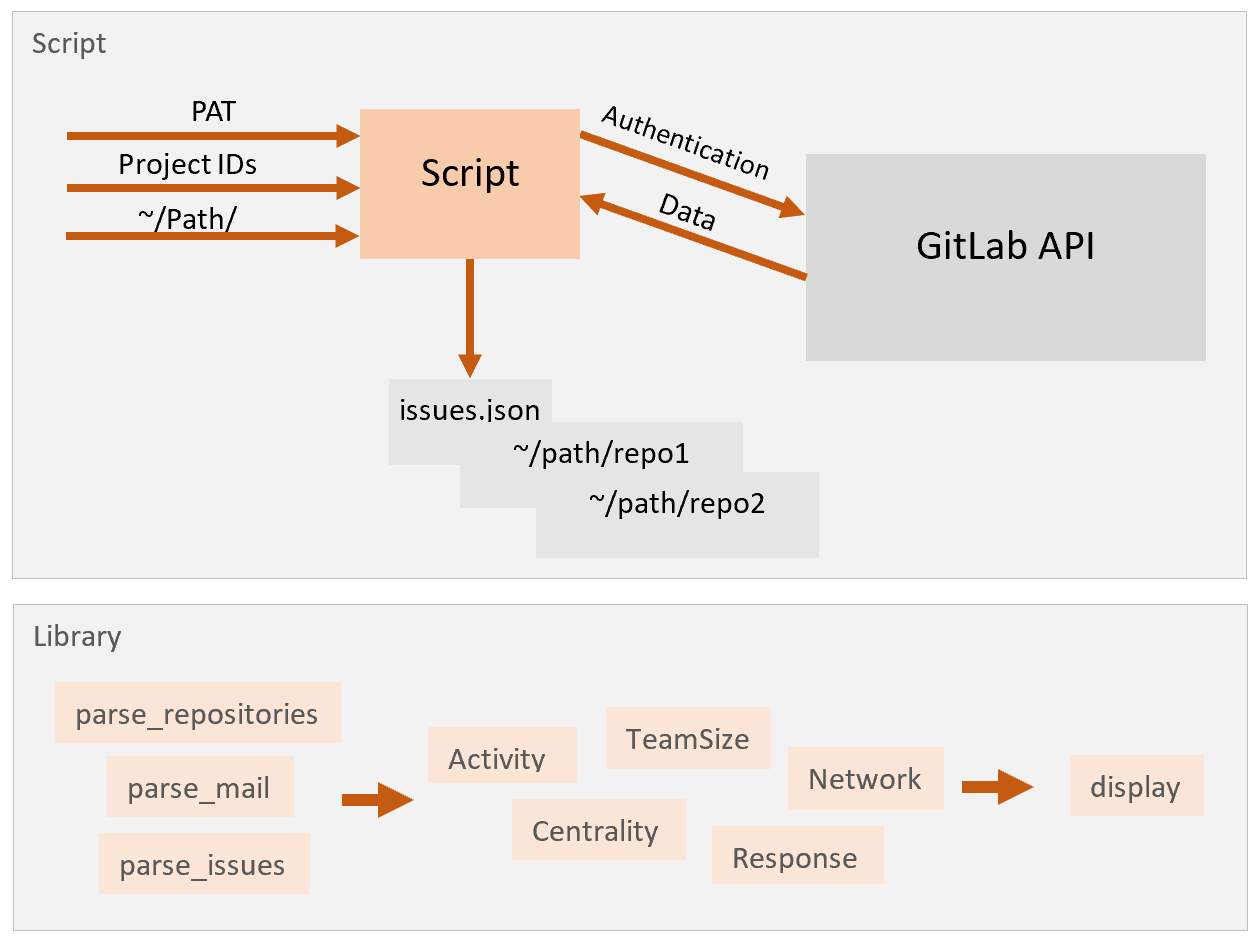
The library consists of three functions for the parsing of the three different data sources, of five functions for the five different analyses, and of one function to display the results. It mainly uses “pandas.DataFrame”, making it more universal. It also allows the user to modify these data frames according to their needs as well as to choose the columns they want to use for their analysis. Indeed, to use the library, the user must specify the data set as well as the columns to be considered when calling each analysis function.
To better illustrate, let’s consider the following code snippet:
commits = cd.parse_repositories('~/path_to_repositories')
activity = cd.activity(commits, 'id', 'author_email', 'date')
cd.display(activity)
Here, we want to perform an activity analysis of some git repositories located at a certain path from the root. We first start by calling the parsing function that corresponds to our data source. That function returns a data frame of the different entries.
Then, we call the activity analysis function on the data frame and specify the columns to be considered.
Finally, we display our result with the display function.
However, to have the authors’ email addresses in our final DataFrame instead of their names, we enter the name of the author email column where the function expects the author names. The result then displays the activity per week for individuals whose emails are those found in the dataset.
Moreover, the display function offers many options. It can receive as a parameter a heterogenous list of elements and displays them differently according to their types. It can also receive a simple pandas data frame and display it. Additionally, to better compare two or more results of the same object type, it is possible to display them on the same figure with the same axes. Examining them would have us look at one figure with different plots instead of repeatedly switch between tabs.
To better illustrate let’s consider this time the following code snippet:
commits = cd.parse_repositories('~/path_to_data')
issues = cd.parse_issues('~/path_to_data')
commits_ts = cd.teamsize(commits, 'id', 'author_name', 'date')
issues_ts = cd.teamsize(issues, 'id', 'author', 'created_at')
cd.display([commits_ts, issues_ts])
Here, we decided to use data from different sources but apply the same analysis to them and then display them at once. The two different figures are then overlaid on the same figure.
Finally, thanks to the separation of the different stages of the ComDaAn process, it is possible to avoid potential redundancies. Indeed, the parsing which is the most time-consuming step of the whole process is done once per data source where it used to be done by each script called and the display is optimized. The global execution time is thus smaller.
And now …
During my four-month internship at enioka Haute Couture, I worked on ComDaAn And more specifically on optimizing the code performance wise, on adding mailing lists and issues as additional data sources, on using the LOWESS regression for smoothing of the different curves displayed, and finally on the design and programming of the interface.
The ComDaAn project has evolved over time thanks to the work and dedication of many contributors. In the same manner, it will continue to evolve and find new ways to serve community data analytics as well as the open source community.